|
 |
| |
|
|
I always wanted to create a CTF map based on my last
texture set,
but I could not find a layout which I was happy with. Recently while browsing
lvlworld I found a gorgeous
CTF map with a cool layout which I thought would look good in stone ...
Evil Gemini
is a small 2v2 CTF map by Mr. Lake featuring a very cool idea, the flag rooms are
next to each other! This simple change allowed the game play to be less
defensive and more intense with fewer places to hide. I really wanted
to work with this layout and contacted Mr. Lake to see if he would
mind and luckily for me he said 'By all means, please do. =)'
I took the original map and de-compiled it to get an idea of structural
scale and where all the items were placed. Once I had a compiled version of
the original map I stripped out all of the detail and converted everything
back into basic concrete blocks. I quickly tested the map to see
if all the original game play was still intact and luckily everything
worked fine.
|
|
|
 |
|
 |
|
 |
| |
|
|
|
One of the challenges of working with someone else's map is to make
your own version different enough to stand out on its own, but still
be recognisable of what map it was based on. With the help of many
emails from my friends, I think I have ended up with a map which
offers good game play and visually looks different.
|
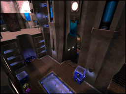
The original map had a narrow central area which stretched from
one side of the map to other. There were raised sections at both
ends which were accessible either by the side rooms or trick
jumps off geometry below.
Each side of the base had two entrances which went into one room
and then upwards via a jump pad into the flag room.
There was various obstacles around the rooms for cover but the routes
to each base was quick, fast and identical.
|
|
|
 |
 |
|
The path through both side rooms always ended with a
jump pad and this seemed like a good place to start with something
different.
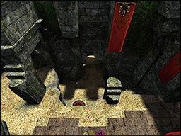
The SG room was changed to have an upper route that connected
directly from the central area to the flag room and the jump pad
was moved to the middle of the room instead.
This change gave the SG room a new primary route that was not
dependant on a jump pad for access to the flag room.
|
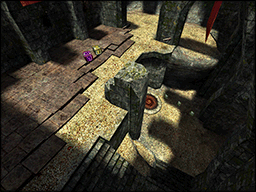
The lower area was setup to be connected via one jump pad and
three trick jump ledges to the side. This proved pointless
because the jump pad was always faster and easier!
A 90 degree turn staircase was added to replaced the jump ledges
and counter the benefits of using the jump pad.
With the room layout having less reliance on the jump pad for navigation the connection
to the flag room was moved further back to balance against the other side.
|
|
|
 |
 |
|
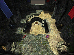
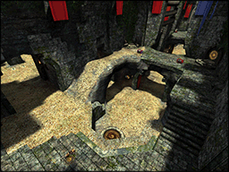
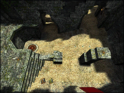
The central area was doubled in width and a new upper area was
added. The three tiered floor space was connected together with a
ramp, a set of stairs and a jump pad. The lower connection was
added later because the bots were using the side rooms to change
height instead of in the central area.
The distance between the bases remained the same because this
was a primary feature of the original map. The new upper area
also created a lot more cover for the lower routes which stopped
the RG dominated so much.
|
Originally I wanted the upper areas to be connected underneath
the flag room via a tunnel that could be seen from above.
The majority of players in small matches went directly from base
to base and this added complexity to the central area was
worthless.
The upper ledge was designed to be the perfect place to snipe
the flag rooms and dominate the central power up on the floor
below. This area was mainly used in 4v4 matches and the
teleporters were added to allow players to quickly switch ledges.
|
|
|
 |
 |
|
The PG room was initially split into two areas with
the top part ending in a difficult jump to the flag room.
The upper area was time consuming to navigate and mostly
ignored by the bots because of the tricky ending.
The jump pad was moved further back into the room and
a new upper area was created which allowed players
to move around easier. The PG was perched between the jump
pad and a new set of stairs which soon became a hot favourite
for the bots.
|
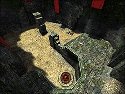
Originally the room was designed to be more open plan and
have a gradual slope upwards to the flag room. Unfortunately
most fights in this area ended very quickly due to the
lack of cover to dodge around.
A couple of pillars were added at one end of the room
for gauntlet dancing and weaving manoeuvres. The upper area
was deliberately left open to preventing defensive tactics.
A bonus GA was placed on the highest pillar for the CPMA hop
skip double jump players.
|
|
|
 |
 |
|
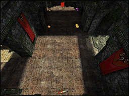
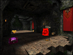
The flag room footprint was increased in size and both entrances were
offset against each other. Having more floor space allowed players
to run circles around each other and swing cats without touching
the sides.
The new layout of the flag room entrances gave each side route
a different cost in speed and ease of use. I really liked the
idea of different strategies for each route to the flag room
and it made the matches feel more thought out and less chaotic.
|
The original map used glass to show what parts of the flag room
could not be reached, but this material did not fit with the new
theme. Eventually I decided to use thick wooden trunks suspended
from the walls as a visual clue instead.
The flag room had an unusual balance of two entrances and three exits
and the drop down at the front of the room needed to be more
obvious. The floor design was changed to make the space more readable
by the player and easier for bots to use.
|
|
|
 |
|
|
|
 |
|
 |
|
 |
| |
|
|
 |
|
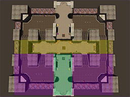
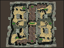
The item layout is grouped together by architectural boundaries into three
different zones, flag room, side rooms and central area. Not all of the items
were mirrored exactly between the bases and some of the weapons were
located in the central area.
The flag room was setup with a RL, YA and 50 health and the side room zones
had the PG and SG with +15 armor / health in each.
The central area contained the RG, LG, 2 x 25 health and various ammo
packs grouped together at each end.
|
The original layout worked really well and only a few small
modifications were made to suit the new architectural changes better.
The PG and SG were moved to the centre of the side rooms and
the +15 armor / health were changed to support one of the routes
(upper / lower) through the room instead.
All the ammo and health in the central area was spread out
to accommodate the extra floor space. The RG ammo was removed
to reduce the effectiveness of the RG weapon.
|
|
|
 |
|
|
|
 |
|
 |
|
 |
| |
|
|
During the alpha phase of the map (while waiting for feedback) I did a couple of
brushwork concepts to work out the level style. I tried to create something that
felt old, had high walls and blended back and forth between rock and brick
effortlessly.
Initially I was going to add more plants and broken bricks to the ground but
I did not want to clutter up the map floor space and make it difficult to move around.
I tried to keep all the detail high up and out of the players way which is why the map
feels old but clean.
All the broken bricks and rock detail comes at a price and that is triangle performance.
The map does have a lot of hints and portals but this is not a magic fix for
the layout which is wide and open. The map can perk up to 30k triangles at some
corners and if you have an old PC I recommend you do not download and play this map.
 |
|
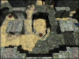
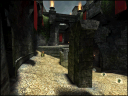
The floor design is asymmetrical with both sides having a different style.
The left side is made from natural materials ( sand and rock ) and has
gradual slopes for height change while the right side is made from bricks
and has stairs instead.
The transition between the sides is angled and broken to make it feel like
both sides were originally the same. The left side is suppose to feel older and
more natural while the right side is newer and more maintained.
|
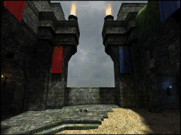
I spent a long time trying to create elements of the map
that are not symmetrical. When structures opposite each
are equal they feel pleasing to the eye. Like for example
the two structural ends in the picture to side, which are
off centre with the middle of the map.
Everytime I look at this part of the map, I feel something
is not right and I need to correct it. To confuse the issue
more I angled the floor edge so the upper structural difference
is not so obvious to the eye anymore.
|
|
|
 |
 |
|
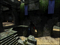
Some parts of the map had large flat surfaces made from bricks
and I could not think what kind of detail to add to them.
I did not want to create endless holes and broken sections
everywhere because I needed parts of the map intact to create a contrast.
While walking to work one day I noticed some walls that had
curved and warped from water damage. I tried this style out on a
large flat wall in my map and it looked perfect. The surface
was not to busy to the eye but was subtlety different from certain
angles.
|
I spent a long time cutting and twisting the bricks along the
rock edges to try and make the transition more natural. I tried to
remove as many straight lines as possible so the walls looked
more eroded and decayed.
The terrain was sloped gradually across all main floor surfaces
but angled upwards against the walls to create interesting
edges and curved lines. When straight lines were used for corners,
they were made to look as man made as possible, so the broken
bricks had a good contrast.
|
|
|
 |
|
|
|
 |
|
 |
|
 |
| |
|
|
|
A couple of years ago I created a map called
Pyramid of the Magician and it
had a lot of crazy brush shapes on the floors, walls and ceilings.
It had far too many weird angles and to be honest, I was not surprised at the
time that no bot file was made for it.
There were countless problems with creating the bot file and most of them centred
around bspc.exe and the way it generated the AAS file. I am sure you are thinking
'why not just bot clip the original map?' Unfortunately it was not that easy because
bspc.exe still loaded in all the other brushwork buried inside of bot clip and eventually
ran out of memory.
To solve this problem Mr Elusive and Ydnar suggested creating a special bot map
that could be re-attached to the original BSP file. After a lot of testing and
discussion, I could not get this idea working correctly and eventually decided
to release the map without a bot file instead. Recently someone at
Q3W
found a way to get the q3map2 system working and this made me curious to
develop a map using the separate bot map re-attach method.
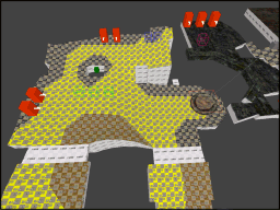
Mystic Gemini was designed to have bot support from the beginning and all
the bot clipping and cluster portals were included in the main map from the start.
Periodically I would test to see if the bot file worked ok but eventually after
detail was added the bot cluster portals broke. Once I had all the floor details done,
it was time to split the bot map off and create a special version.
|
 |
|
The only part of the original map I wanted to start with was the floor. This is the
primary surface for the bots and it had to be as close as possible to the human version.
I removed all the walls and upper details and then simplified some
of the floor edges because I wanted the new wall structure to be as basic as possible.
I converted all of the floor brushes to structural and worked through a long list of
leaks to make sure the map would compile again.
|
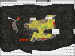
Once the floor was finished I created a simple set of wall brushes that
went from the floor straight up to the skybox. I followed the floor shape to
a certain degree but certainly not to the same level of detail as the original.
All of the connecting corridor ceilings were reduced to flat surfaces and the
organic rock structures in the central area were converted into very blocky
brushes instead. This was done in preparation for the bot cluster portals
which I wanted in certain locations to create good sized cluster areas.
|
|
|
|
 |
|
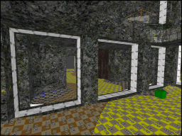
Bot cluster portals should have clean surrounding brushwork to be reliable.
Any extra brushwork touching the portal surface can cause splits and
this can increase the chance of the portal being broken.
I assumed that the bot file was an exclusive space for the bots to move around in but this is
not the case. Bots will not sink though the floor if the bot file has a lower floor.
With a flat lower floor space I can force the bot portals to be exactly where I want
them, everytime I compile the map.
|
With the bot file created from a separate map and then linked back to the original
BSP the AAS file got reduced from 14Mb to 1.7Mb!
The AAS file ended up being split evenly into 7 well sized clusters and after
a lot of testing the bots flowed around the map extremely well.
I am not sure how many people actually play CTF style maps with bots nowadays but at
least everyone has the option and all the work I did hopefully will pay off with
someone enjoying a game with bots.
|
|
|
|
|
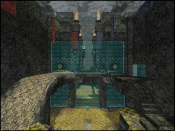
After the bot file had been created, I still carried on adding more detail
to the main map. This usually screws up the bot cluster areas because
the order of the map file changes and bspc processes it different.
I would often spend hours trying to get the bot portals working again,
but not anymore. The bot portals are in a separate map and work everytime!
During the beta phase of the map both side rooms were changed around because of
problems with the game play for the lower routes. Also the bots would sometimes get
caught on the jump pads endlessly bouncing up and down and it looked extremely dumb.
I knew I had to fix these problems but luckily the bot map was a lot simpler
so the work involved was not too much.
|
|
|
|
 |
|
 |
|
 |
| |
|
|
|
Initially I had lots of torch burning loops and groups of randomly timed gusts of
wind scattered around the map. I wanted to design the ambient sound landscape
to be low key and not too distracting to the player. I did not want the opponent
location clues like items being picked up and foot steps to not be heard.
It was very late on the development of the map that the blue side gained light
crystals instead of torches and this allowed for the bases to be more
varied and interesting. I used the ambient sounds from my previous map because the
sound quality was so good and it worked well with the atmosphere of the
new map.
I was not sure if everyone wanted to play the map with all the ambient
sounds that I included, so I decided to create two separate pk3 file instead.
Depending on the load order by the engine (pk3 files are loaded alphabetically)
will determine which sound pack is finally loaded.
A friend of mine recommended that I add a music file to the map. Initially I
thought the default music for Quake 3 would be the usual brain dead heavy
guitar loops that so often plague FPS games. Luckily I was surprised and found
a nice ambient background track which suited the map perfectly.
|
|
|
|
 |
|
 |
|
 |
| |
|
|
| - |
Mr. Lake for all the time and effort you have poured into this
project. This map proved to me that two designers are better
than one. It was a pleasure chatting with you. =)
|
| - |
PJW, Shallow and v1l3 for all your advice and support. Your
comments and suggestions were amazing and helped to make the
final map a much stronger release.
|
| - |
Ydnar for Q3map2, your hard work on the compiler made this map possible.
|
| - |
ID for creating Quake 3 Arena. Even after 10 years the game is
still amazing to map for.
|
|
|
|
 |
|
 |
|
 |
| |
|
|
| Map Type | CTF - VQ3 and CPMA. 3v3 or 4v4 players (16 spawns per team) |
| Bot File |
Optimised into 7 zones using a special map |
| Layout | Based on a map called
Evil Gemini by Mr. Lake |
| Item Balance | 2xYA,2xRL,2xPG,2xSG,1xLG,1xRG,1xRegen (CPMA 2xGA) |
| Development | 6 months, about 5-6hrs per week. version - 46 (3w) |
| Textures | Mostly based on my own digital photo's |
| Skybox |
Jochum Skoglund / Hipshot,
http://www.zfight.com |
| Sounds | All custom sounds by Marauder |
|
|
|
 |
|
 |
|
|


