|
 |
| |
|
|
|
The map started out life as an experiment to see if was possible to link
together a portal sky and the ground space of a level seamlessly. Both domains
are often treated as separate entities in maps and I felt it was worthwhile exercise to
see if it was possible to create a visual link between the two that was not obvious
where one stops and the other continues.
|
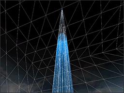
The first experimental map featured one cylinder model on the ground and a
second one in the portal sky.
The models required various amounts of tweaking with scale and placement
but eventually they locked together and the illusion was complete.
With the aid of additional textures and various degrees of alpha transparency,
the edges of each cylinder were blended together. On the ground additional
cylinders were setup to make the light effect brighter and more detailed next
to the player.
|
|
|
 |
 |
|
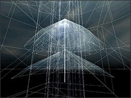
The rest of the sky portal was made up of several cloud layers stacked on top of
each other and then setup to rotate slowly around the centre of the beam like
a vortex. Each cloud layer was fine tuned with additional fade and glow effects
to create more depth.
The beam was made up of several particle like textures that flowed up both cylinders
and then alpha faded into the clouds.
Eventually a pulse effect was added that had to be painstakingly synchronized across
both cylinders with unique shaders.
|
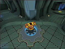
Powerful items and weapons often have their actual locations marked so that
everyone knows where they will appear in a level. The style of the
floor markings can range from an obvious light fixture cut into the ground,
to a simple set of scratches or a burn mark.
The idea behind the cog was to create a floor marking that could be moved around
and work with any ground texture. The surface was animated so that it would
be noticeable up close and the vertical glow was added so that it is recognisable
from a distance.
|
|
|
 |
 |
|
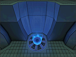
The original Quake3 jump pad had a certain style that everyone recognises and expects to
work in a certain way. There was often no particle clue to the direction
but usually just a simple rapidly expanding circle to represent a push effect.
The new design takes the original flat shape and raises it up from the ground so that it
stands out from its surroundings. The surface is still animated so that it is
noticeable up close but an upward particle stream effect is added so that
the function is visually intuitive.
|
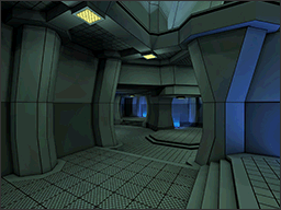
The map is made from simple textures with no detail and just hard black lines.
The detail comes from the architectural shapes, the concave
walls braced by chunky support pillars, the inverted fat columns
and the high wall guardians with glowing lights for eyes and long
curved noses.
All these structures are saturated with a mixture of pastel yellow and intense
blue lighting which creates a vivid alien landscape punctured by various sky
windows of strong bleached white light.
|
|
|
 |
 |
|
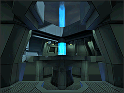
The base of the focal beam is a structure supported by two long arms
connected to stout columns and a central thick ring perched above a platform of
swirling energy, pulsating up towards a vortex of clouds far above.
The area is the intersection of three different heights and hopefully the
meeting place of heavy weapons and long range fire fights. The architecture is
designed in steep angled layers and should feel like the base of some alien
machine, distorting the clouds above.
|
|
|
|
 |
|
 |
|
 |
| |
|
|
| Map Type | FFA 4-8 players, 1v1 / TDM |
| Layout | Small map with fast and frantic gameplay |
| Item Layout FFA | 1xYA,1xRA,1xRL,1xLG,1xGL,1xPG,1xSG,1xQuad/Haste |
| Item Layout 1v1 | 2xYA,2xRL,1xLG,1xPG,1xSG,1xMH |
| Bot File | Optimized with fixaas to 5 clusters |
| Development | 3 weeks, final version - 25 (1AY) |
| Textures | Inspired by
Evil Lair Template texture set |
| Skybox | Photo sourced by me |
| Sounds | Wind sounds by marauder |
|
|
|
 |
|
 |
|
 |
| |
|
|
| - |
ID for creating Quake 3 Arena. Even after 10 years the game is
still amazing to map for.
|
| - |
Thanks PJW for being there with awesome gameplay and support feedback.
|
| - |
Thank you AEon for helping me fix the countless technical
problems and gameplay testing.
|
| - |
Thanks PatH and V1¦3 for some amazing ideas and support.
|
|
|
|
 |
|
 |
|
 |
| |
|
|
1.ay (My own version - FOCAL_P132)
+ Added 1v1/TDM item layout using game type keys (only works for 1.32 point release)
- Reduced light map scale on selective architecture to prevent IOQ3 light map bug
- Removed competition sponsor advertising as it is not needed anymore
+ Added more texture detail to level, darker wall panels and spawn decals
+ Cut up more brushwork/patches to prevent tjunc sparklies
1.ax (Competition version - FOCAL_FINAL)
* Fixed light bleeding issues near +50H, horrible surface hack
+ Raised up ramps by YA platform by 8units, should be easier to jump up
- When loaded in IOQ3, map hits max_lightmap warning, not fixable at present
+ Cut up more brushwork/patches to prevent tjunc sparklies
1.aw
* Fixed AMD logo not been drawn correctly (bottom text was missing)
* Extended all nodrop JP brushes to prevent mid wall item drops
* Fixed some light bleeding issues, 2 still remain near +50H :(
* Destination entity for JP next to quad has been shifted over
+ Cut up more brushwork/patches to prevent tjunc sparklies
1.av
+ Made map compatible with Quake 3 point release 1.16n
- Removed 1v1/TDM item layouts, multiple item configs not possible with 1.16n
- Simplified the quantity of textures due to 1.16n shader limits
- reduced the resolution of large overlay images on decals
* Merged all sponsor images into one mega image because of 1.16n limitations
* Move around sponsor images (IN GAME) to reduce stretch and pixelation
* Swapped the PG and GL around, ammo remains the same (1 box each)
+ Fixed visual hole at the side of the RL ledge staircase
+ Added more surfaces to the top of the RL ledge for RJ reasons
* Converted corner geometry to models and fixed light map errors
+ Added more player clip, GL corridor, back of RL ledge, above SG
+ Fixed various tjunc patch/brushwork sparklies around level
+ Created a new gfx shader for the base of focal beam
1.au
* Moved +50H to the upper balcony around corner from PG
+ Added +5 per second health bonus to FFA mode for the laser beam
- Removed 2 player spawn locations, 1 near RL and other near SG
* Converted spawn point in RA room to bot only
* Changed Power FFA spawn to Quad/Haste (Spawn ratio 2/1)
* re-created all JP to land player at top correctly
* Aggressive player clipping around all JP locations
+ 1v1/TDM item layout - 2x YA/RL combo, MH, LG, SG and PG only
+ Added more bot clipping and fix to make bots do second RL area jump
+ Switched out some wall panels for dark versions to add more contrast
+ Reduced all portal sky textures in resolution (video card memory issues)
+ Added all sponsor adverts around level (using greyscale vers mostly)
+ Second pass to lighting, removed all black areas and smoothed out edges
* Fixed lower portal sky models not been seen correctly around map
+ Tested bot follow mode in TDM game type to all locations of map
1.at
* Moved some ammo and health out of the LG room to beam upper platform
* Shifted some of the player spawns around and deleted 2 in the RA room
* Tweaked the bot roam entities for the RA area (lower values)
* Converted some light fixtures into models for light map reasons
1.as
+ Created bot file via fixaas q3map2 system (5 clusters)
* Tested item layout; 5 weapon, 2 armour, Quad/Regen powerup's
* Replaced the small room YA with a RA instead, (possible balance issues)
* Finished laser room architecture from concept image (in my head)
+ Sealed top map architecture to reduce amount of light leaks
+ Finished custom artwork (various floor markers and extra panels)
+ Fine tuned performance with Hint brushes, whole map < 12k rspeeds
+ Linked lower sky portal models to various parts of the map
+ Setup 16 player spawn points, spread out around the level
+ Created player spawn markers to help prevent telefrags
+ Added nodrop to jump pads to prevent bot yoyo item problems
+ Heavily clipped areas around jump pads to prevent bounce back
1.ac
+ Tested architectural style concept, curved wall space with heavy wall supports
+ Created basic texture set (high resolution - 512 min)
+ Tested lighting textures with a blue/green/gold colour palette
+ Found a way to create solid shader decals for item markers
+ Designed a unique jump pad model that shows visually the push force direction
+ Setup the skybox portal system, tested the map -> sky model connection
+ Fine tuned the sky portal model placement, grrr hours of tweaking!
+ Created all skybox texture assets from my own photo sources
+ Sketched out a basic layout with the laser beam room being the central feature
|
|
|
 |
|
 |
|
|


