|
 |
| |
|
|
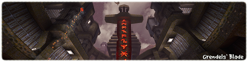
Far above the ground and beyond the wispy clouds roaming the skies is
the home of the giants, characters born from legends and portrayed in
the twinkling of the stars. Their lives mapped out for all to see and
sing about, as their followers rejoice in their benevolence.
It was a cold winter night and a storm was brewing over the coastline.
The clouds were swirling and churning into a large dark mass while the
occasional lightning strike was torching the driftwood on the beaches.
As the winds grew stronger and the howling peaked, the sound of crashing
metal and roaring giants could be heard in the distance.
As the storm picked up speed and moved inland, the lightning grew with
vigor and intensity as a trail of destruction was being left in its wake.
People were running scared from their homes as the lightning flashed
with such strength that the night sky momentarily became day.
The swirling storm clouds bulged and burst in the middle, revealing
a tunnel up to the stars above. With one gigantic flash of lightning,
an enormous blade of metal with glowing hot mystical runes tore through
the eye of the storm. The blade pierced the ground and ruptured the
molten lava below as burning boulders were thrown far and wide.
The zealots believing this was a sign from the stars, commanded that
the blade was a holy site worthy of a temple to be built for the giants.
People came from far and wide to appease the star giant Grendel with
this architectural folly and try to gain his favour.
At the base of the temple was a lake of bubbling lava, burning the tip
of the blade causing the runes to glow brightly. Small fragments of
the blade had fallen into the lava and for some reason would not melt.
When anyone got close to the metal shards, they would glow with a
faint blue light and were consumed with madness and rage.
The great craftsman and ancient map maker
Matthias Quad
found a way to
shape the blade fragments into weapons that could be used to unleash
the power of the blade. The surrounding six cites of the temple decided
that these weapons could not be kept together or controlled by one city
and it was decided to split up the weapons to secure peace.
Over the years the cities bickered and fought for control of the weapons
and each assumed they were the true followers of the giant. The temple
priests had other plans and turned the site into an impregnable fortress
instead. They declared they were waiting for the rightful one to return
with all the fragments and unite the blade, revealing its true purpose!
The Bringer of Quads
Six Quads to find them all,
Six Quads to break them,
Six Quads to blind them all,
and with blue light take them!
|
|
|
 |
|
 |
|
Deconstructing Match Four
|
|
|
|
| |
|
|
The Quake Single Player (SP) community often has 'jam' events where
different visual themes and gameplay ideas are explored within
a limited time frame. Community member
'dumptruck_ds'
recently organized
a jam
based on the theme of
DM4 (The Bad Place)
and that indeed made me curious, because I love making blue maps for Quake!

|
|
Originally created by
American McGee
the map features a very distinct blue runic metal theme, a crazy amount of
teleporters and a large amount of (highly contrasting) red hot lava consuming
the bottom of the level.
Constantly played on Quake Multiplayer (MP) servers (even till this day),
DM4 is a very fast paced map where a lack of understanding for the
teleporter interconnectivity, can result in being highly familiar
with the player respawn locations instead!
|
DM4 is not your typical MP experience and has several features that are not
often found in modern day layouts. The large central atrium has
multiple floor/ledges with restricted connectivity (lack of stairs or lifts)
and instead relies on teleporters or rocket jumping to move upward.

|
|
My favourite DM4 'feature' is the location of the Mega Health (MH)
tucked away in a dead end on the lower floor of the central atrium.
The entrance is guarded by a very narrow sharp angled corridor
and the middle of the room is denied by a large lake of lava.
What makes this area special is the 'cat and mouse' style
combat that can occur with 1v1 player duels. If you see someone
go for the MH do you wait for them to come back out?
Or do you chase them and hope they get the timing
of the MH wrong!
|
With so much of the map shaped by sharp corners, precarious
walkways and lethal environmental hazards, the weapon of
choice for most players is the rocket launcher (RL).
Between spamming rockets at unsuspecting players turning tight
corners and knocking players off walkways into pools of certain death,
its no wonder this map is a firm favourite of rocketeers.

|
|
There are two rocket launchers (RL) on either side
(for balance) of the map and the rest of the weapons
are scattered throughout the central atrium, with the
Super Shotgun next to a large stack of ammo and health.
The item respawn timers coupled with item locations really
lets this map down. With FOUR armour pickups
in close proximity on 20s timers (rest of items 30s) and the
Mega Health on a slow 120s timer, the dead end area is a
dubious risk/reward compared to the fast spawning rate of the
Red Armour on the other side of the map!
|
The primary texture used across most of DM4 is a corrugated
blue 'mmetal1_3' metal which is horizontally seamless and has a
defined top/bottom edge for easy geometry alignment. This texture is
highly flexible with good coloured alternatives (metal2_3, metal4_6)
and can easily be wrapped around corners or edges
without the need for special trims.

|
|
Most of the floor space in DM4 is covered with a seamless
texture 'cop1_3' which is really best suited on generic metal surfaces
and unfortunately lacks any kind of pattern or shadows
suitable for a floor surfaces.
Some of the side atrium ceilings are covered in chunky metal
'metal1_3' cross beams highlighted with a strong light source above
that creates beautifully striking shadows. The remaining
upper canopy spaces are covered in a brightly detailed blue
marble 'metal1_6' texture which is unusually named!
|
The majority of the textured light sources 'metal5_8' are wall indented
and have a really awkward pixel dimension for alignment. Due to the colour
and style of
this texture it can easily be confused with Gold Key Symbols and
probably not a good idea for Single Player maps.
The teleporters are covered in a crucifixion 'light3_7' texture on all sides,
including the inside edges which makes the alignment and shadows look
really odd.
Most of the corrugated blue wall corners are highlighted with runic style
pillars 'metal6_1' and 'metal6_2' that cleverly make good door
frames without custom setups. The generic brown 'metal1_3',
blueish 'metal1_4' and grate 'cop1_7' trims accent various details
throughout. The remaining DM4 textures are mostly used on
animated surfaces.
|
|
|
|
|
|
|
|
| |
|
|
The jam briefing was 'To create a single player (SP) level using the
DM4 visual or spacial theme' and I spent a long time flying around the
original map looking at the layout, its various visual structures and
overall style.
While I can appreciate DM4 as a MP map, I am not really a big fan
of the narrow right angle layout and some of the DM4 textures just
make me cringe.
Eventually I decided I was not getting the DM4 jam vibe and should
probably do something else instead.
I have been wondering for quiet some time, what it would be like
to use only vanilla Quake textures and to see how far I could
push them into different directions.
Maybe it was time for a vanilla texture jam, where everything is
just tiny tiles of pixel goodness and no trims!

|
|
I often like to start my projects by picking the textures,
working out compatible colours and matching them together like
blobs of paint. I find it useful for collecting together
compatible themes that have a good cohesive vision.
I started with DM4 textures and then expanded into the
metal runic sets, which I think shares plenty of common
colours and are a good style for large vertical spaces.
I also collected up all the various bluish textures from
the later Quake episodes and finished off with some
rockwork stuff for contrast.
|
I wanted a landmark that could emphasized the vertical space,
something that would encourage the player to look upwards and
be excited about where they were going to travel next.
I went through the usual suspects of towers, obelisks and various
ideas featuring chains suspending chunks of rocks, but eventually
I settled on the idea of the sword in the rock, Caliburnus.

|
|
I opened up my editor and jumped straight in. I had my texture
palette on one side and a stack of brushes showing different
player heights on the other side and right in the middle,
was a giant chunky metal blade!
I know there are plenty of people who love to plan levels
with 2D drawings, but I think its easier to plan 3D maps
with 3D tools.
Even if you are just mashing together generic shapes,
I think it will give a much better idea of available space
and help to prevent level or player scaling issues.
|
I started with the floor (probably the most important part of a
level) and began to spiral up around the blade.
I used mirrored structures at each compass direction to save time
with blocking out and setup the corners with rows of greek style
curved pillars for hopefully cool silhouettes.

|
|
Once the blade was in place I added a large platform with
cracks flowing outward for the player to see the lava below.
Then I made some quick and dirty rockwork around the walls
to catch the light of the lava glow.
During the block out phase of the map, there was a large
pile of rockwork underneath the blade in the lava.
The idea was to have a platform puzzle to access a teleporter
close to the lava, but unfortunately it was too inviting
for exploring players and I changed it to something more
secretive instead.
|

|
|
As the central area started to take shape, each corner
of the map was locking into place with the various side
buildings and the symmetry was starting to show.
A quick solution to fix this problem was to
rotate one of the corners around 180 degree's.
The extra space created by the rotation was perfect
for observing secret areas and bringing the player
closer to the blade in the middle.
It also featured one of my favourite moving part
sequences in the whole map, the cascading metal
shutters!
|

|
|
With so much circular symmetry existing in close proximity
to the blade, I knew that each surrounding building was
going to have to be as unique as possible.
The first building featured a hodgepodge of 19th century
European roof designs, a pair of octagonal towers and
some cool use of runic panel lights as narrow window
slits instead.
The structure felt very heavy and had a good Gothic vibe
as it loomed over the player from many angles. There was
even space for a roof top secret via the Ivory Key.
|

|
|
The second building was designed to compliment the blade
when viewed from a certain angle. The deep shadow lines
on either side are suppose to represent the distinct
look of an Egyptian headdress as it crowns the hilt
of the blade from below.
I really liked the small cliff side buildings on either
side as contrasting shapes to the rockwork flowing
into the distance. I always thought metal5_4' floor
texture looked better on vertical surfaces, the light
and texture shadows are perfect for roof tiles.
|

|
|
The third and fourth buildings are rotated duplicates
designed to work with the ascending curved arches on
either side and smoothly lock into the front pillar
details.
The large runic doors at the back originally opened,
but due to performance reasons and a better route
with side doors, the runic blocks were bolted shut.
I really liked how the front pillars turned out,
with the ascending thickness, runic details and the
strong blue trims drawing the eye upward.
|

|
|
The challenge was vanilla textures only
and I knew this was going to have an impact somewhere.
I wanted the map surrounded by rockwork on all sides and
a very large and detailed texture was the perfect fit.
With no chance of a custom textures, the next idea was
to use contrasting materials like sedimentary rocks.
This will allow the detail to come from the brushwork
edges instead of the texture.
Luckily the dirt settings for this map were strong and
this created extra depth for the inside edges,
preventing the rockwork from become one blob.
|
With the map dripping in blue tiles and trims, I knew that some
areas would need contrasting colour schemes, especially for the
players who don't recognize architectural details as landmarks.
Each floor height was setup with alternating tile colour so
that the different vertical spaces can be recognized quicker.
All the visual language items (buttons, lifts, doors) are
consistent in their design and should be easier to identify
from their surroundings.
Any doors that are wall details, are shown to be locked
with bars to cut down on interactive confusion.
I have been a big fan of coloured lighting in maps for a long time
and have been trying for years to convince everyone of
its merits with subtle colour setups, but this time I wanted to
try something different.
Instead of using colours for every light source, I wanted all the
textured light fittings to be white and colourless, so that the
surrounding textures retain their original colour instead.
Obviously the lava and sky surfaces emit coloured lighting, but
the rest is just white and it does create an eerie coldness
to indoor areas that goes really well with the runic texture set.

|
|
The first area is flat like a pancake, got plenty of pillars
for cover and has a high vaulted ceiling to reduce
the feeling of claustrophobia. I especially liked how
the bulbous blue wall trims worked and the assault course
of ceiling cross beams linking shortcuts.
The gameplay setup is the classic two button progression trick
with the second floor access being revealed by a Shalrath
planted firmly on the connecting lift down.
Did you play hide and seek or run around the pillars
trailing voreballs into unsuspecting knights?
|

|
|
What started out as just a simple shortcut lift connecting
the starting area to the Silver Key, eventually turned into
a tight multi-floored area with a quad powered Widowmaker
and a ceiling full of Celtic knot like runic piping!
While riding the lift between the floors, I hope most
players will look up at the ceiling and shout
'What the hell is that!?!'
Initially it was roof detail around the final exit
teleporter to prevent the player from escaping the map,
but I loved the style so much, I went a bit bonkers
with the Copy and Paste Wand instead!
|

|
|
The lava cave is the big colour change for the map,
the contrast that knocks everyone out of their blue
comfort zone.
Carved out from a mountain of rock and supported by a
lattice of enormous metal beams, the cave is patrolled
by a horde of enemies waiting for a quad addicted player
to show up and see how far they can get before the power
runs out!
I especially like the interlocking octagonal upper
walkways, they are 100% ogre approved for grenade to the
face meet and greet introductions!
|

|
|
The last indoor area is a mixture of small blue bricks
and corrugated metal walkways, spiralling around the
inside of a large vertical chamber.
Perched at the top is the final map objective,
the Gold Key.
The primary theme for this area is brickwork and there
is plenty of emphasis on vertical combat with ogres
and knights attacking from all sides. I think the
highlight of this area is the ornate ceiling design,
a giant runic piping doodle to hopefully draw the
player to look up!
|
|
|
|
|
|
|
|
|
| |
|
|
This map layout is a departure from my usual (non-linear) style and
probably a bit more focused on routes that guide the player,
while they are running around on quad juice.
Unfortunately the central area is really small and the player is
really fast and that is never a good combination for map progression.
The solution (though not ideal) was to force the player to drop down
for gated doors and then re-use the central area several times.
One of the advantages of spiralling around the blade for progression,
is that the player can see the next section off in the distance and
know where they are going.
This also has a positive affect for indoor sections of the map,
because when the player comes back to the central area,
they often are familiar with the location already.

|
|
When building the blade I knew the hilt would make
such a good path for progression.
With grand views of the surrounding architecture and
a memorable route, its the perfect reward for climbing
up so high.
The spikes on the hilt were added to create a pause in
player progression and are removed via two floor buttons.
The whole setup can be completely avoided if the player
gets the Ivory key first and then climbs across the hidden
roof space to the other side.
|

|
|
The map layout is a typical linear progression
(area 2 is optional) from one area to the next
and should not be too difficult to navigate
because of the central landmark.
Each area has a couple of self contained shortcuts that can
be unlocked by the player. They are mostly direct routes
to help prevent back tracking and repeating empty spaces.
I think the value of shortcuts is often overlooked,
especially if the player knows how they connect and is
involved in the activation.
|

|
|
I never expected something in plain sight to be so
well hidden.
Absolutely no tester of this map found this location
on their first play through and there was plenty of
staring in the general vicinity for long periods of time!
I setup large curved ledges on either side, the platform is
brightly lit and there is even a special message
for trick jumpers if they can slope jump off the rocks below!
I just got the impression that everyone assumed it was wall
detail and there was nothing to investigate.
|

|
|
I was not expecting this area to play out the way it did.
The location was designed as a shortcut, a way to get a
powerful item and the chance to bypass the first
quad run. It was a reward for knowing my secret style,
of hiding things with demon faces.
The exit to this shortcut was overlooking the first
area and giving the player the chance to do a series
of tricky jumps. I never thought anyone would try
this in reverse and yet plenty of testers did and
succeeded and even ended up with a better visual treat!
|
Over the years I have done plenty of different types of combat
setups in Quake maps and some are certainly more popular than others.
One type I rarely do is quad runs, because they really only work best
with linear layouts that the player can run through easily and find
enemies quickly. This is why hidden quads can be frustrating, because
they are often found after all the combat is over!
I have always wondered, what would it be like to fill up a
map with as many quad runs as possible? (considering floor space)
Would players go with the flow and just keep running? Would they
waste the quads being cautious and getting distracted with exploring
for secrets? Would they try to save the quads for later? These
crazy questions need answers!

|
|
I did not want to waste any time and less than a minute
into the map, a quad run! Right there in the open next
to a button, in the right place and very much the right
time to be used!
I think that is what makes the first quad run so
satisfying, is the game turns the simple starting weapon
into a one shot gib making machine.
With the clock ticking, can the player run faster?
can they get as many enemies as possible? everything
is just a mindless blur of urgency and gratuitous
satisfaction as map goals fade away.
|
Over the years my use of powerups has mostly been for secret
hunters and very rarely do I leave them out in the open, or
plan for them as part of combat. Often they are just
like a skill modifier to make an encounter easier.
Maybe the real magic of powerups is to find them easily and
actually enjoy them while they last, instead of missing them
in secrets and having nothing left to fight!

|
|
I wanted the player to fall down into the lava cave area
with an active Quad and go on a rampage, but I could not
get anyone to do it!
I have always found that players will be cautious about
dropping down into unknown areas, even if there is a
good reward, they still hesitate.
I tried tempting players with the quad over the hole,
but no one was interested. Eventually a friend suggested
I make it look like there was a way to escape by
adding fake lift runners and funnily enough it worked!
|

|
|
In the Gold Key area there is a hidden shortcut that
allows the player to avoid the lower route and exit
high up near the key instead.
This area has a Quad run which is setup to start once
the player gets close to the Gold Key, but it does not
work for the upper route. To get around this problem,
the Quad starts up high and is dropped down when the
lower platform is activated.
This means the Quad is in the right place for both
routes and the player is none the wiser!
|
Its tricky to find the right balance for the ending of a map.
Is it over too abruptly? Has it got too many waves? Is the player
movement too restrictive? somebody will always complain.
Obviously there is no right way to end a map and its certainly
impossible to make everyone happy, but nevertheless its still
the last impression and should probably try to end on a
good note, right?

|
|
I did not want to create a special area for the final
fight because the blade and all its vertical space
would then be wasted. I wanted something that was
focused around the exit teleporter, with free player movement!
With so much of the map being open space
(especially all the building towers) it seemed like
the perfect opportunity to get the player involved
in a good vertical fight. Due to the lack of floor space around
the exit area, I knew my monsters of choice are going to
need to fly and use projectile attacks.
|
I have already introduced the gaunt (AD version) gradually
throughout the map and it seemed like a good choice for the end
fight. Its not a giant bullet sponge, it has a strong projectile
attack and in packs can be a challenge on higher skill
levels. Using the gaunt in combination with scrags for different
waves, it would be the perfect progression for intensity.
The final ingredient for the fight is something that can apply
some pressure and nothing does that better than a monster
which spawns other monsters! One of my favourite spawner is
the brown skinned Minotaur, because it takes a fair amount of
damage to take down, can spawn gargoyles really quickly and the
real kicker is ... its got cell resistance! Oh yeah! :P
I did not want the final fight to go on for ages or be really
complex. I decided on a simple three wave setup with multiple
Minotaur's on different towers and a nice zombie knight surprise
at the end for higher skill levels. The trigger for the waves are
all present around the exit teleporter and if the fight gets
overwhelming the player can just jump down and deal with it
at slower pace.
I really hope that everyone who has got this far
(Oh my god it really was too much) down the page has enjoyed
the map waffle and if anyone has any further questions,
constructive feedback or even some first time demo's, then
please email me!
Burnt Out Wreck
Sims
|
|
|
|
|
|
|
Secrets, Mega Secrets and Unmarked!
|
|
|
|
| |
|
|
Everyone loves to find secrets! Whether its the surprise of a
new item or the excitement of an undiscovered area behind a
hidden door, the unexpected gets players hooked!
The real challenge for secret makers is to keep creating variety
and that can be difficult (especially with time limits) because
it is always tempting just to stick shootable buttons on
ceilings or inside alcoves!
Even with plenty of secret variety there should be enough of a
discovery range that some are easy to find, while others are more
of a challenge.
I usually start with a couple of easy secrets and then add some
duplicates, so that players who find one type, can then find
the other and feel good.
When creating maps for Arcane Dimensions I do like to use
breakables as a secret type, usually with a special texture
so that its easier to spot the difference throughout the map.
Level Designers often overlook that Quake secrets are a
way to speak directly to the player, either through witty
messages or words of encouragement for finding them.
During the beta phase of this map I
decided to tweak all of the secret trigger messages to be more
unique and less verbally standard. The feedback was mostly
positive with the change!
Each thumbnail image below is a map secret,
click on the image for a clue where its located!
Mega style secrets are often made from multiple objectives and this
can be hard to follow in Quake, due to the lack of a customizable
User Interface (UI) to represent player progression.
Most players will lose interest in mega secrets because they are
difficult to keep track of, but hardcore secret hunters
will certainly be more determined.
With such a limited audience and the possibly of extra time and
effort, its easy to understand why most Level Designers leave
adding a mega secret to the last minute.
The obvious question is
'Should mega secrets be more accessible to more players?'
and that will depend if the extra content is worth keeping
as something special or just as a regular secret.
Quake maps do already have plenty of mixed skill based content
and its perfectly logical to treat a mega secret the same way,
as something of an extra challenge to be found and completed.
Once the giant blade was complete I thought it looked very
bland, it needed something extra to become a focal point.
I have always been a fan of the runes on the Hell Knight (HK) sword
and especially liked how they represented something mystical.
I tried adding HK style runes to the blade, but unfortunately
they looked really crude and blocky.
So I decided to replace them with Celtic runes instead and
that looked much better with well defined and angular shapes.

|
|
Initially when I created the map, I blocked out the complete
spiral path up around the blade to the final exit.
On the top platform I had a runic style Episode three prefab
teleporter.
The teleporter was made from a single row of runes across
the top and the classic 45 degree angled runes down the sides.
The brushwork really needed to be more prominent and grand
in scale because this was the final exit. So I extended the
top structure upward with more runic blocks and then added
two giant pillars on either side.
|

|
|
While creating the new teleporter structure I was
wondering what it would look like if the bottom
of the teleporter structure was an altar instead of a
portal entrance.
After a quick copy, paste and some brushwork prefabs,
the altar fitted perfectly with the rest of the teleporter
brushwork and was an ideal chunk of detail for the rest
of the map.
The final piece to the altar was the glowing Celtic
rune in the middle to highlight any items for the
player to pickup and make the altar look more special.
|
As I was using more and more of the runes from the blade for the
different altars around the map, I realized it would be
the perfect way for the player to complete the mega
secret. As the player would destroy the altar runes, the progression
could be shown on the blade and this would finally fix the
problem of showing what's left to do for the mega secret!
The first 13 thumbnails below are rune altars,
click on the image for a clue where they are located
The last 2 thumbnails are about what happens
after all altar runes have been destroyed!
The 'unmarked secrets' started out as interesting places to put useful
stuff that was not too difficult to find. These type of secrets are all about
exploration and trying to work out the best path to get to them. They are often
visible from some point in the map and just there to tease the player
while they are running around like crazy on quad juice!
Originally I had all the places labelled with a cheeky message about
how cool it would be for a secret location! After a couple of times
it became really frustrating and annoying to see the message, so
I decided to change all of the triggers to be something more
direct and funny. Hopefully everyone will find the
humour less frustrating.
Each thumbnail image below is an unmarked secret,
click on the image for a clue to find it!
|
|
|
|
|
|
|
|
| |
|
|
| Map Type | Quake SP only |
| Requirement | Arcane Dimensions MOD + Patch 1 |
| Skill Levels | Easy 118, Normal 184, Hard 242, NM 258 - Monsters |
| Development | Six weeks |
| Textures | All ID textures |
| Source | Map included in the ZIP file |
|
|
|
|
|
|
|
|
| |
|
|
| - | ID software for creating Quake |
| - | Additional map feedback and testing by ben, eric, henrik rob, and sean. |
| - | BSP/VIS/Light Compilers - v0.16.0 by Eric Wasylishen |
| - | TexMex 3.4 by Mike Jackman (good for organizing textures) |
| - | AdQuedit 1.3 by Hicks Goldrush (perfect for pak files) |
|
|
|
|
|
|
|
|


)
)
)
)
 "The Bad Place")
 "DM4 Deadend")
 "DM4 Layout")
 "DM4 Textures")
 "Texture Palette")
 "First Doodle")
 "Lake of Lava")
 "Top Down Center")
 "Building 1")
 "Building 2")
 "Building 3")
 "Rock Stripes")
 "Tricky Beams")
 "Runic Pipes")
 "Lava Cave")
 "Vertical Ledges")
 "Top of the Blade")
 "Map Quarters")
 "Ledge 2")
 "MH Shortcut")
 "Quad Runs")
 "Quad Hole")
 "Quad Platform")
 "Final Fight")
)
)
)
)
)
)
)
)
)
)
 "End Portal")
 "Rune Altar")
)
)
)
)
)
)
)
)
)
)
)
)
)
)
)
)
)
)
)
)
)
)
)
)
)
)
)
